
Mobile devices are about to overtake PCs as the main online shopping channel, even though many online stores are still anchored to their desktop versions
It is highly likely that you are reading this article on a smartphone or tablet rather than a computer. Mobile devices are now the main platform for Internet access, as shown, for example, in IACM’s Internet User Survey. It is only a matter of time before smartphones also become the preferred channel for online shopping.
Indeed some sources already believe that m-commerce has higher online sales volumes globally than e-commerce, albeit due to the boom in mobile devices throughout Asia. In the rest of the world, e-commerce has not yet been outstripped by m-commerce, but it will not take long. In the United States, eMarketer calculates that 34.5% of online purchases were made from mobile devices in 2017, and estimates that it will be the dominant channel by 2020.
In Europe, the same consultancy firm points out that m-commerce generates 42% of online purchases in the United Kingdom, 39% in Germany and 32.1% in France. A Criteo survey of online stores in Spain found that 34% of users prefer mobile devices, while, according to IAB Spain, 77% of Internet users have made a purchase on a mobile device, even though it is not their usual channel.
80% of users check their smartphones to gather information about their online “shopping trips”, even if they finally make their purchase on a computer. The smartphone is therefore, in one way or another, the most important player in e-commerce today.
Online stores still penalize mobile users
Faced with the growing prevalence of mobile devices, it is surprising how unprepared most online stores are. A study by the price comparison service Idealo on a sample of 50 leading national e-commerce sites shows that 16% did not yet have a web design adapted for mobile devices (which is not the same as a true “mobile-friendly” store), and only 42% had an app for mobile devices.
Having a website adapted for mobile devices is only the first step to offering a satisfactory user experience in m-commerce. According to a study carried out in the United States in April 2018, only 46% of online stores surveyed believed that the mobile version of their site offered the same features as the desktop version. In 38% of cases, users have access to fewer features when browsing on their smartphones.
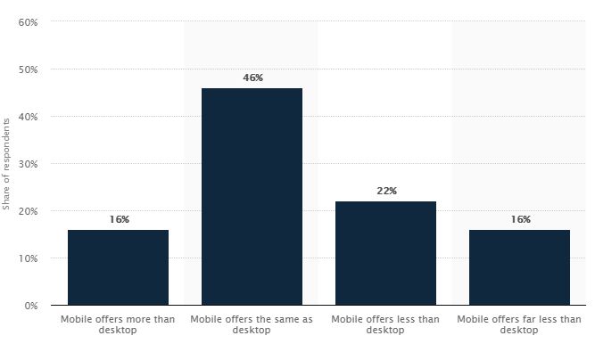
38% of mobile online stores offer fewer features than their desktop version. (Source: Statista)
Any quick check of leading online stores using a smartphone will show that the same is also true here. According to users of mobile versions, the biggest shortcomings of online stores include: inferior display of product information due to the small screens on mobile devices; the difficulty of entering all the required information on a mobile device into forms designed for a PC; and the lack of confidence in mobile payment processes.
The keys to adapting to the “mobile” revolution
I know from experience that changing to a mobile-first mindset is not easy for an e-commerce company. But the benefits outweigh the drawbacks. For example, when we redesigned Bebitus’ mobile strategy in 2017, conversions increased by 21% and the rebound rate was reduced by 4% in our mobile version.
However, the process is far from straightforward, since it requires a cultural change in organizations, which for many years have focused on desktop versions. In this sense, online stores which are just starting out will have it much easier if they follow the following premises:
- Start with a mobile-first mindset: the mobile version should be given precedence from the very conception of the business model, the design of the online store, the definition of the commercial strategy, etc. Adapting an e-commerce site designed for desktop computers to a mobile channel is much more costly.
- Prioritize the mobile user experience: speed, simplicity and trust must be key to the user experience in the site’s mobile version. Something as simple as offering several levels of information in the product description (an initial description and a detailed description) makes it much easier to check on a smartphone.
- Focus on image and video: multimedia must be at the fore of the product description. Including images, videos, tables, charts, etc. helps sell better than any text, no matter how persuasive. The copy should simply back up the image and build trust (e.g. by adding user feedback).
- Eliminate all superfluous elements: the compact screen size of mobile devices means that any possible distraction must be eliminated: pop-up windows, aggressive banners, menus with too many elements or options… the more minimalist the page, the more functional it will be for the mobile user.
- Simplify the purchase process: ideally, the purchase process should consist of two steps: entering the buyer’s details/payment method and confirming the order. Lengthy registration processes, order forms that require more information than necessary, and any other complications should be avoided.
- Optimize, optimize and optimize: the possibilities to improve the mobile version of an online store are never-ending. Checking usability, conversion, speed, etc. must become a day-to-day task that is part of the business scorecard. Mobile technology moves quickly, and it is important not to be left behind.
In the novel the iconic film Blade Runner was based on, the writer Philip K. Dick wondered if androids dream of electric sheep. Undoubtedly, the only way to succeed is for the person in charge of an e-commerce site to think in m-commerce terms, at all times.
